# Make TalkBubble
This is my first blog that written by English without Chinese, thus if there has some mistakes, just figure out and leave a message, I'm glad to correct the mistake, as the proverb goes Love & Peace.
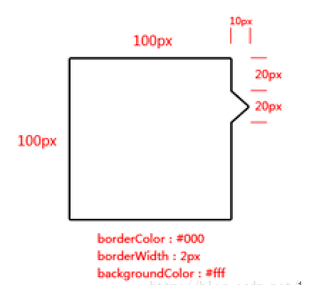
There is a requirement to make talk bubble by CSS in object,just like this:
To achieve that goal, you first must know pseudo-element such as :before and :after , and how to use it.
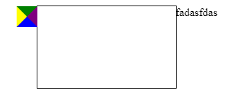
One simple demo for using pseudo-element , the purpose for this demo is show the changes in styles caused by border property.
HTML
<div class="talk-bubble"></div>
CSS
.talk-bubble {
  margin: 50px auto;
  width: 200px;
  height: 118px;
  border: 1px solid black;
  position: relative;
}

.talk-bubble:before {
  position: absolute;
  content: '';
  width: 0;
  height: 0;
  right: 100%;
  border-top: 15px solid green;
  border-bottom: 15px solid blue;
  border-left: 15px solid yellow;
  border-right: 15px solid purple;
}

.talk-bubble:after {
  position: absolute;
  content: 'fadasfdas';
  width: 0;
  height: 0;
  left: 100%;
}
2
3
4
5
6
7
8
9
10
11
12
13
14
15
16
17
18
19
20
21
22
23
24
25
26
27
The result presented by the page like this :
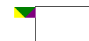
From that image we can see the result by the :before is a square in the left , the side length of the square is 30px ,if we don't set the property of border-bottom , we can see the page under the below:
so we know the effect of the width of each side. Let's go back to the original question, we can achieve the goal through these code.
  .talk-bubble {
    margin: 50px auto;
    width: 100px;
    height: 100px;
    border: 2px solid black;
    position: relative;
  }

  .talk-bubble:before,
  .talk-bubble:after {
    content: '';
    width: 0;
    height: 0;
    position: absolute;
    left: 100%;
    border: solid transparent;
  }

  .talk-bubble:before {
    border-width: 12px;
    border-left-color: black;
    top: 20px;
  }

  .talk-bubble:after {
    border-width: 10px;
    top: 22px;
    border-left-color: white;
  }
2
3
4
5
6
7
8
9
10
11
12
13
14
15
16
17
18
19
20
21
22
23
24
25
26
27
28
29